Did you know that the colors in your home’s interior can really affect your mood and health? Some colors can make you feel more energetic, while others help you relax.
We know how crucial it is to pick the right colors to make your space a reflection of you. In this article, we’ll look at the newest interior design trends. We’ll also share our top color ideas to make your home’s aesthetic shine.
Choosing the right colors can turn your space into a stunning and useful place. Let’s explore our favorite color choices to change your space with color.
Key Takeaways
- Discover the latest interior design trends to inspire your next project.
- Learn how to choose the perfect colors to enhance your home’s aesthetic.
- Explore our top color ideas to transform your space.
- Understand the impact of color on your mood and well-being.
- Get tips on creating a beautiful and functional space.
Understanding the Impact of Color on Interiors
The colors we pick for our homes can really change how we feel. They can make our homes look and feel amazing. It’s key to know how color affects our mood and the vibe of our spaces.
Colors can make us feel certain ways and change how we see things. By picking the right color palette ideas, we can make our homes feel welcoming, calm, or lively. It all depends on what we need.
The Psychology of Color in Home Design
Color psychology is all about how colors affect us. In home design, knowing this can help us choose colors wisely. This includes colors for walls, furniture, and more.
Cool colors like blues and greens can make us feel calm. Warm colors like oranges and reds can make us feel energized and cozy. Using these effects, we can design spaces that support our well-being.
How Colors Affect Mood and Atmosphere
Let’s look at how color can change a room’s feel. A recent trend report shows how a deep blue can make a room feel electric. This shows how bold colors can make a room lively and engaging.
When picking colors for our homes, we should think about the mood we want. Whether we like trending color schemes or softer tones, our choices should match our style and the room’s purpose.
| Color | Emotional Impact | Design Use |
|---|---|---|
| Blue | Calmness, Trust | Bedrooms, Offices |
| Red | Energy, Passion | Living Rooms, Dining Areas |
| Green | Balance, Growth | Living Areas, Outdoor Spaces |
By knowing how colors affect us, we can make better choices in interior design. This way, we can create spaces that are not just pretty but also good for our well-being.
Popular Interior Color Trends for 2023
In 2023, we’re seeing a big change in interior color trends. There’s a focus on bright colors and natural tones. Homeowners are looking to update their spaces, and some colors are becoming very popular.
Bold and Vibrant Shades
This year, bold and vibrant shades are making a big impact in home decor. Colors like Kelly Green and Slate Blue are top picks for adding color to rooms. You can use these colors on accent walls, furniture, or as a main color for a modern look.
When using bold colors, it’s key to balance them with neutral elements. This prevents the space from feeling too busy. For example, pairing a bold wall color with neutral furniture creates a nice balance.
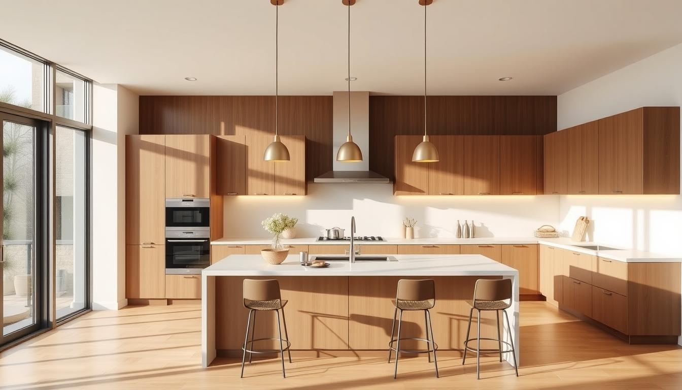
Earthy Tones: Bringing the Outdoors In
On the other hand, earthy tones are becoming more popular. Homeowners want to bring the outdoors into their homes. Shades of green, terracotta, and sandy beige are among the best wall colors for a calming, natural feel.
Earthy tones fit well in many design styles, from rustic to modern minimalist. They can make living rooms and bedrooms cozy. They also add warmth to kitchens and dining areas.
Choosing the Right Palette for Your Space
Finding the right color palette can change your space for the better. We’re here to help you pick the perfect colors for your home. With so many paint options for home interiors, it’s easy to get lost. But, by focusing on a few key points, you can find the right look for your home.
Factors to Consider When Selecting Colors
Think about the look you want before you decide. The natural light in your home plays a big role in how colors look. Rooms with lots of sunlight can handle darker colors, while rooms with less light do better with lighter shades.
Also, think about your furniture and decor. You can match your colors to them or plan to change them later. For ideas, check out our room colors and find your favorites.
Tips for Creating a Cohesive Look
To get a cohesive look, focus on the undertones of your colors. Choosing the right undertones is key to a harmonious palette. Cool undertones can make your space feel calm, while warm undertones add coziness.
- Begin with a neutral base color for a calm background.
- Pick a few accent colors that match your base and add depth.
- Use the 60-30-10 rule: 60% of your main color, 30% of your secondary, and 10% of an accent.
By using these tips and understanding your space, you can make a welcoming and stylish atmosphere that shows off your taste.
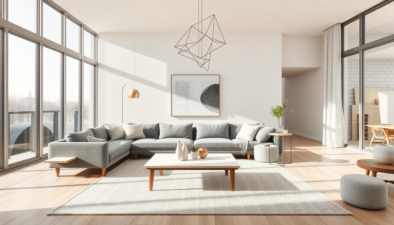
Incorporating Neutrals into Your Home
Adding neutrals to your home’s color scheme can really change things. Neutrals offer a flexible background that suits many styles, from modern to classic.

The Timeless Appeal of Gray
Gray is a top choice for interior design today. It’s loved for mixing well with other colors, making spaces look smart and stylish. For example, a soft color like Raindance by Benjamin Moore can make a living room feel like a cozy spot.
“Gray is a versatile color that works well with both bold accents and subtle textures, making it a favorite among interior designers.”
Warm vs. Cool Neutrals: What’s Best?
Choosing between warm and cool neutrals is key. Warm neutrals, like beige and taupe, bring a cozy vibe. Cool neutrals, such as gray and blue, offer a calming feel.
| Neutral Type | Characteristics | Ideal For |
|---|---|---|
| Warm Neutrals | Cozy, inviting, earthy tones | Living rooms, bedrooms |
| Cool Neutrals | Calming, serene, often blue-based | Bathrooms, kitchens |
Choosing between warm and cool neutrals depends on what you like and your space’s needs. Knowing the differences helps you pick the best for your home.
Accent Colors: Adding Depth and Interest
Adding accent colors is a simple yet effective way to add depth and interest to your space. Accent colors can transform a room from dull to vibrant. They create a visually appealing atmosphere that reflects your personality.
Effective Use of Accent Colors
To use accent colors effectively, consider the 60-30-10 rule. 60% of the room should be a dominant color, 30% a secondary color, and 10% an accent color. This balance ensures the accent color enhances the space without overwhelming it.
Key areas to apply accent colors include:
- Throw pillows and blankets
- Artwork and decorative accessories
- Rugs and mats
- Wall decor and vases
Popular Accent Color Choices
Some of the trending accent color choices include bold and vibrant shades like deep blues and rich ochres. Earthy tones are also gaining popularity. They bring a natural and organic feel to interiors.
| Accent Color | Description | Ideal Use |
|---|---|---|
| Deep Blue | A rich, saturated blue that adds luxury and sophistication | Accent walls, decorative accessories |
| Rich Ochre | A warm, earthy shade that brings coziness and warmth | Throw pillows, rugs, and artwork |
| Emerald Green | A vibrant, energetic green that adds a pop of color | Accent furniture, decorative items |
By incorporating these accent colors thoughtfully, you can create a space that is not only visually appealing. It also reflects your personal style.
Color Combinations That Work Well Together
Choosing the right colors for your home is key. It’s not just about what you like. It’s about making your home feel welcoming and stylish.
Good color choices can make your home look better. It can feel more inviting and classy. We’ll look at two important ways to mix colors: complementary colors and monochromatic schemes.
Complementary Colors: Enhancing Your Design
Complementary colors are pairs that are opposite each other on the color wheel. This contrast makes each color pop. For instance, blue and orange together can make your living room lively.
Some great pairs include:
- Blue and orange
- Red and green
- Yellow and purple
It’s important to balance these colors right. Use one as the main color and the other as an accent. This avoids too much color.
Monochromatic Schemes for Simplicity
A monochromatic scheme uses different shades of the same color. It makes your home look cohesive and elegant.
Monochromatic schemes have many benefits:
- They create a sense of continuity
- They make rooms feel bigger
- They make choosing colors easier
To use a monochromatic scheme, pick a base color. Then, choose various shades and tints of that color. This adds depth and interest.
By using these color principles, you can make your home beautiful and welcoming. Whether you like bold contrasts or simple schemes, the right colors can change your space.
Painting Techniques for a Professional Finish
The success of a painting project depends on knowing the different paints and how to use them. Whether you want to update one room or your whole house, the right techniques are crucial. They help you get a finish that looks like it was done by a pro.
Understanding Different Paint Types
There are many paint types, each with its own special qualities and uses. You’ll often find flat (matte), eggshell, satin, semi-gloss, and high-gloss paints. Flat paint is great for ceilings and places that don’t get a lot of use because it covers up imperfections well. But, it’s not as tough as other finishes.
Semi-gloss and high-gloss paints are more durable and easy to clean. They’re perfect for kitchens, bathrooms, and trim because they can handle a lot of cleaning.
When picking a paint, think about the room’s use and how much it will get cleaned. For example, a child’s bedroom might need a satin or semi-gloss finish to last longer with frequent cleaning.
Essential Tools for a Smooth Application
Having the right tools is as important as picking the right paint. You’ll need good brushes, rollers, and trays. Natural bristle brushes are best for oil-based paints, while synthetic brushes are better for latex paints. For big areas, a roller with an extension pole can save you time and effort.
- Use a roller with a thick nap (about 1/2 inch) for textured surfaces.
- Opt for a roller with a shorter nap (about 1/4 inch) for smooth surfaces.
- Always use a paint tray with a grid to remove excess paint from the roller.
By knowing the different paints and using the right tools, you can get a professional-looking finish. This will make your home look better and increase its value.
Color Inspiration from Nature
Looking to bring the outdoors into your home? Nature’s colors can inspire your interior design. These colors can make your space feel calm, lively, or warm. They’re perfect for color palette ideas.

Nature’s colors work well together, making them great for decorating. For example, a mossy green in a living room can feel like a forest. You can find inspiration in sunsets, flowers, stone, and wood.
Utilizing Natural Elements in Your Color Scheme
To use nature’s colors in your home, watch the outdoors. See how colors change with the seasons. Notice how water, earth, and sky mix.
For example, a guide to choosing the best home colors can help. It shows how to pick colors that show nature’s beauty.
Some popular nature-inspired colors include:
- Earth tones like terracotta and sienna, which warm up a room.
- Soft greens and blues, like leaves and water.
- Neutrals like beige and sand, for a calm feel.
Biophilic Design: Enhancing Indoor Spaces
Biophilic design connects nature with our built spaces. It uses natural elements and colors to make our homes better. This design boosts well-being and helps us love nature more.
To use biophilic design, add natural materials and lots of light. Also, include plants in your decor. With a nature-inspired color scheme, your home can feel like a natural haven.
Transforming Small Spaces with Color
The right wall colors can make small spaces feel bigger and more inviting. When you have limited space, the correct interior home colors can make a room seem larger or more cozy, depending on what you want.
Light Colors to Create an Illusion of Space
Light colors can make rooms look bigger. Shades like whites, creams, and soft pastels reflect light and open up a space. For example, a soft cloudy blue can make a long, narrow living room feel cozy while still looking spacious.
- Use soft, neutral tones on walls and ceilings for a seamless look.
- Avoid bold patterns and bright colors that can make a space feel smaller.
- Choose colors that match the natural light in your room.
Dark Colors for Cozy Elements
Dark colors can add coziness to small spaces, even if light colors make them look bigger. Using dark shades on accent walls, furniture, or decor can add depth and warmth. For instance, a deep, rich color on one wall can become a focal point and add character.
- Paint one wall with a darker shade to create a focal point.
- Use dark colors on furniture and decor to add depth without overwhelming the space.
- Balance dark elements with lighter colors to keep the room harmonious.
By carefully choosing interior home colors and best wall colors, you can turn your small space into a welcoming and functional area that suits your needs.
Final Thoughts on Interior Home Colors
Exploring interior home colors shows us how the right colors can change a space. They can affect how we feel and the mood of the room. With the latest interior design trends in mind, we can make a space that’s both stylish and personal.
Putting Your Own Stamp on Your Space
Choosing paint for your home’s interior is all about finding the right mix. It’s about blending current trends with what you like. This way, you can make a space that really shows who you are.
Knowing When to Refresh
As design trends change, knowing when to update your colors is key. Whether it’s one room or your whole house, think about the latest trends and what you like. This will help you make choices that are both informed and personal.