Did you know a good color palette for home interior can change your mood and how productive you are? A single color scheme brings harmony to your home. It makes your space look designed and thoughtful.
This is key because it boosts your home’s look and makes it welcoming.
Choosing the right home decor color schemes can seem hard. But with the right help, you can make your home feel peaceful. In this guide, we’ll talk about why color palettes matter. We’ll also share tips on picking the best one for your home.
Key Takeaways
- Understand the importance of a unified color scheme for visual harmony.
- Learn how to choose a color palette that elevates your home’s aesthetic.
- Discover tips for creating a harmonious and inviting atmosphere.
- Explore different home decor color schemes to suit your style.
- Find out how to make your home feel more intentional with the right color palette.
Understanding the Importance of Color Palettes
The colors we pick for our homes can really change how we feel. They’re not just about what we like; they deeply affect our mood and well-being.
Studies show that colors can make us feel different ways. For example, yellow makes us happy and cheerful. Blue helps us feel calm and peaceful. Knowing this helps us pick colors that make our homes feel right.
The Impact of Color on Mood
Colors can really change how we feel. Orange boosts our energy, making it great for gyms or playrooms. Green balances our emotions, bringing harmony and calm.
| Color | Emotional Impact |
|---|---|
| Yellow | Happiness, Cheerfulness |
| Blue | Calmness, Serenity |
| Orange | Energy, Vibrancy |
| Green | Balance, Harmony |
How Colors Influence Space Perception
Colors don’t just change our mood; they also change how we see our spaces. Light colors make rooms look bigger. Darker colors make spaces feel cozy and intimate. Knowing how to use colors can make our homes look better and work better.
Choosing the right colors can make our homes better in many ways. Whether you want a calm place to relax or a lively spot to work, the right colors can help.
Elements to Consider in a Color Palette
When picking colors for your home, think about a few key things. The right colors can make your home look better and feel more welcoming. It’s all about creating a space that looks good and feels right.
Room Functionality and Purpose
Each room has its own needs when it comes to color. Bedrooms need calming colors like soft blues and greens to help you relax. On the other hand, home offices and kitchens do well with bright colors to keep you energized.
Lighting and Its Effect on Colors
Lighting changes how colors look in a room. Natural light, artificial light, and the color of light bulbs all play a part. Think about your home’s lighting when choosing the perfect paint colors to get the look you want.
“The right color palette can transform a space, making it feel more welcoming, spacious, or cozy.” – Interior Design Expert
Color Combinations to Avoid
While it’s fun to get creative with colors, some combos are better left alone. Mixing bright, bold colors can be too much. Pair bold colors with neutral ones for a better look.
Think about each room’s needs, lighting, and color choices to make your home beautiful and functional. This careful planning will help you pick the best colors for home design that show off your style.
Popular Color Schemes for Home Interiors
Choosing a color scheme for your home can seem hard. But, knowing popular schemes can make it easier. We’ll look at some top color schemes for a beautiful, harmonious home.
Monochromatic Color Palettes
A monochromatic scheme uses different shades of one color. It makes your space look cohesive and calm. For example, using blue shades from light to navy can create a soothing feel.
Benefits of Monochromatic Schemes:
- Creates a sense of continuity
- Can make a room appear larger
- Simplifies the decision-making process for decor
Complementary Color Schemes
Complementary colors are pairs that are opposite each other on the color wheel. They add contrast and interest. For instance, blue and orange together create a lively atmosphere.
Tips for Using Complementary Colors:
- Use one color as the dominant and the other as an accent
- Balance warm and cool tones
- Experiment with different shades and tints
Analogous Color Combinations
Analogous colors are three next to each other on the color wheel. They create a smooth, cohesive look. For example, blue, green, and yellow-green make a natural, calming effect.
Advantages of Analogous Colors:
| Color Scheme | Mood Created | Best Used In |
|---|---|---|
| Blue, Green, Yellow-Green | Calming, Natural | Living Rooms, Bedrooms |
| Red, Orange, Yellow | Warm, Inviting | Dining Rooms, Kitchens |
By using these popular color schemes, you can make your home look better. Whether you like monochromatic, complementary, or analogous, the goal is to create a welcoming space that shows your style.
How to Create a Cohesive Color Story
To make your home look great, you need a cohesive color story. This is the key to a welcoming and beautiful home. By picking colors that match well, your space will look intentional and nice.
Selecting a Base Color
The first thing to do is select a base color. This color will be the base of your color palette. Think about the mood you want in your home. Calming colors like blues and greens can make it peaceful. Bright colors like yellows and oranges can make it lively.
Look to nature, art, or your favorite furniture for inspiration. For more tips on choosing colors, check out our guide to home interior color schemes.
Adding Accent Colors
After picking your base color, it’s time for accent colors. These colors add depth and interest. They should match your base color and make your space look better. Choose colors that are opposite your base color on the color wheel for a nice contrast.
For example, if your base color is a cool blue, pick a warm orange or yellow for accents.

Balancing Neutrals and Bold Choices
It’s important to balance neutrals and bold choices in your color story. Neutrals like beige, gray, and white can calm your space. Bold colors add energy and personality. Find a balance that feels right to you.
Use neutrals for big areas like walls and furniture. Save bold colors for smaller items like throw pillows, rugs, and art.
By following these steps and thinking about color psychology in home decor, you can make a color story that makes your home look and feel better.
Drawing Inspiration from Nature
The natural world offers a wide range of colors. These colors can make our homes feel welcoming and peaceful. By looking at nature’s colors, we can pick a color scheme that shows our style and brings calm to our homes.
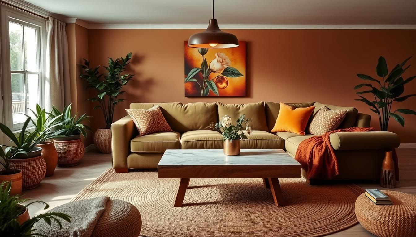
Earthy Tones for a Calming Effect
Colors like sage greens, sandy beiges, and misty blues can make a room feel calm. These colors remind us of nature and help create a relaxing space.
Using earthy tones in your home decor is easy. Just paint your walls a soft green. Or add natural textures like woven baskets and jute rugs to your space.
Seasonal Color Trends Inspired by Nature
Nature’s colors change with the seasons, giving us endless inspiration for home decor. Autumn’s warm tones can make our homes cozy. Spring’s bright colors can refresh our decor.
“Nature is painting for us, day after day, pictures of infinite beauty.” – John Ruskin
By using seasonal colors, our home decor stays fresh. We can add seasonal hues with throw pillows, blankets, and vases.
When we take inspiration from nature, we make our homes more beautiful. We also create spaces that are in harmony with the environment. This way, we can have a more balanced and peaceful home.
Utilizing Color Psychology in Design
Using color in home design can change our living spaces. It can make them more welcoming or calming. By knowing how colors affect our mood, we can make spaces that help us feel better.
Warm Colors for Inviting Spaces
Warm colors like reds, oranges, and yellows make spaces cozy and inviting. They spark conversation and energy, perfect for living rooms and dining rooms.
A warm red can make a room feel cozy and comfortable. A bright orange can boost creativity and excitement. But, it’s key to mix warm colors with neutral ones to keep the space balanced.
Cool Colors for Relaxation Areas
Cool colors like blues, greens, and purples calm us down. They’re great for bedrooms and bathrooms. These colors help reduce stress and bring peace.
A soft blue can make a room feel serene. A gentle green can bring balance and harmony. Think about the shade and how bright the color is to get the right feel.

Let’s look at how color psychology affects home decor. We’ll compare warm and cool colors in different rooms.
| Color Type | Ideal Room | Effect |
|---|---|---|
| Warm Colors | Living Room, Dining Room | Stimulates conversation and energy |
| Cool Colors | Bedroom, Bathroom | Promotes relaxation and calmness |
By using color psychology, we can make our homes reflect our style. We can also support our emotional and mental health.
Testing Color Swatches and Samples
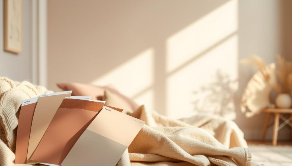
To make sure you choose the right paint colors, test them in your home’s lighting. This step is key in picking the perfect colors for your space.
Testing colors requires thinking about lighting. A color can look different under various lights. Experts say, “The right color can change a room, but wrong lighting can mess it up.”
“The right color can transform a room, but the wrong lighting can distort the color entirely.”
The Importance of Lighting in Color Selection
Lighting affects how colors look in your home. Natural light, artificial light, and room direction all play a part. For example, a color might look great in a bright room but not in a dim one.
To really see how a color will look, watch it at different times and under different lights. This helps you see how it will change over time.
Observing Colors at Different Times of Day
Colors can look different in the morning and evening because of the changing light. Watching your color swatches at these times helps you understand how they will look.
- Morning light: See how the color looks in the soft, natural morning light.
- Afternoon light: Note any changes as the sun moves and the light becomes more direct.
- Evening light: Observe how the color appears under artificial lighting, which can change its look a lot.
By testing color swatches and samples carefully, you can make a smart choice. This way, you can pick the perfect paint colors for your home. You’ll match the latest interior color trends too.
Personalizing Your Color Palette
Creating a space that feels like home starts with a personalized color palette. It’s about adding elements that show who you are, where you come from, and what you value. This way, your home becomes a reflection of your life and a place of beauty and meaning.
Incorporating Personal Style and Preferences
Your style is key in picking the right colors for your home. Do you like bold colors or soft ones? Your choices should match your personality. Think about your favorite clothes, art, and places you love. For example, if you love nature, you might choose earthy tones like sage green or sky blue.
Consider the mood you want your home to have. Do you want it to feel lively or calm? Colors can change how your home feels. Warm colors like terracotta can make your home cozy, while cool colors like blue can help you relax.
Reflecting Heritage and Culture in Color Choices
Your culture can also guide your color choices. Colors mean different things in different cultures. For instance, red is lucky in many Asian cultures but means death in some African ones.
“Colors have the power to evoke emotions and convey messages that transcend language barriers.” –
To honor your heritage, use traditional colors and patterns in your decor. This could be through furniture, rugs, or accessories. It creates a color story that’s both meaningful and beautiful.
| Cultural Influence | Traditional Colors | Design Elements |
|---|---|---|
| Asian | Red, Gold, Jade Green | Lanterns, Calligraphy, Nature-inspired motifs |
| African | Earth Tones, Kente Colors | Masks, Tribal Patterns, Natural Textiles |
| European | Rich Reds, Blues, Gold | Ornate Furniture, Classical Motifs, Luxurious Fabrics |
By blending your style, preferences, and heritage, you can make a color palette that’s both beautiful and tells your story.
Transforming Spaces with Color
Color can change how we feel in our homes. By picking the right colors, we can make our spaces look better and feel different. It can even affect our mood.
Color is a key part of interior design. It can make rooms feel bigger or cozier. It can also help define areas in open spaces and tie everything together.
Choosing Colors for Smaller Rooms
In small rooms, the right color can make a big difference. Light colors on walls and ceilings can make a room seem bigger. Dark colors can make it feel cozy but smaller.
Here are some tips for small rooms:
- Use light, neutral colors on walls and ceilings to create a sense of openness.
- Select a bold, darker color for an accent wall to draw the eye and create depth.
- Minimize clutter and keep furniture to a scale that fits the room, ensuring it doesn’t feel overcrowded.
For example, a small bedroom can look bigger with soft white walls and darker trim. A bold accent wall adds interest without making it feel cramped.
Using Color to Define Areas in Open Spaces
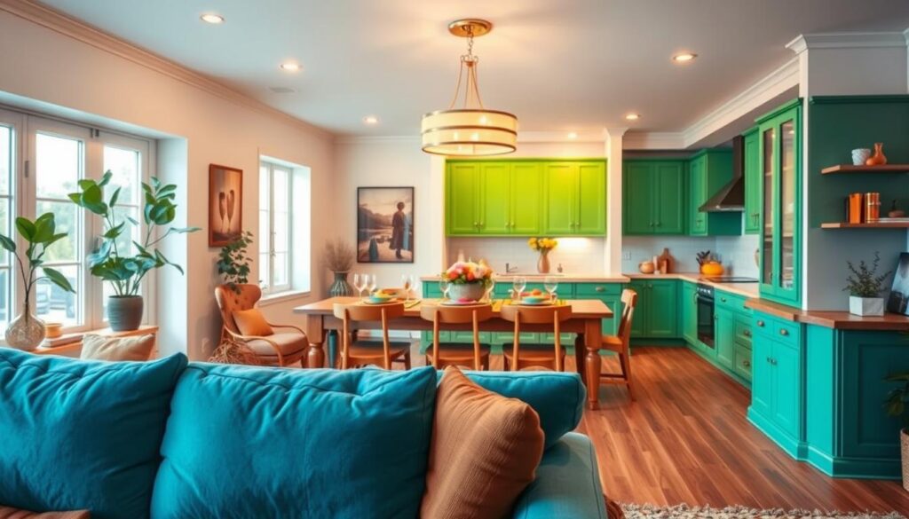
In open-plan living areas, color can help define zones. Different colors or shades can show where the dining area ends and the living room starts.
Here are some ways to use color to define areas:
| Area | Color Strategy |
|---|---|
| Dining Area | Use a bold, rich color for the dining area to create a focal point. |
| Living Room | Choose a more subdued, neutral tone for the living area to create a relaxed atmosphere. |
| Kitchen | Select a bright, inviting color for the kitchen to make it feel welcoming. |
As interior design expert,
“Color is a powerful design element that can dramatically change the feel of a space. By carefully choosing colors, homeowners can create a harmonious and functional living environment.”
By using these strategies, homeowners can make their living spaces better. They can be more functional, beautiful, and show off their personal style.
Finalizing Your Color Palette
Choosing the right color palette is key to expressing our style and matching our home’s look. It’s more than picking colors; it’s about making a space that feels right.
Consulting with Professionals and Friends
Getting advice from experts and loved ones is a smart move. Interior designers bring their knowledge, while friends and family share their honest views. Their input helps us see how colors will feel in our daily lives.
An interior designer might say, “A neutral base with bold colors adds energy and balance.” Their advice is crucial for our final choice.
“The right color palette can turn a house into a home, showing off our personality and style.”
Taking the Time to Make the Right Choice
Don’t rush to decide. It’s important to test colors under different lights and at various times. This ensures our colors look good and feel right for us.
| Color | Daylight | Artificial Light |
|---|---|---|
| Soft Blue | Calming | Cool |
| Warm Beige | Inviting | Cozy |
By taking our time, we make sure our colors are not just pretty but also fit our lifestyle.
In conclusion, picking the right color palette is a careful process. It involves getting advice and making thoughtful choices. This way, we create a home that’s both stunning and truly ours.
Maintaining Your Color Palette Over Time
Keeping your home’s color palette fresh is key. A good color scheme can make a space feel welcoming and functional. To keep your decor exciting, it’s important to repaint and refresh areas now and then.
Refreshing Your Space
Repainting is a simple way to give your space a new look. It’s a great way to update your home without big changes. Try painting accent walls or whole rooms to keep your colors bright.
Adapting to Seasonal Changes
Changing your colors with the seasons is another smart move. You can add seasonal touches with throw pillows, blankets, or vases. This way, you can change up your decor without sticking to one color all year. For more ideas, check out Emily Henderson’s guide.
By following these tips, we can keep our homes looking great and in style.


