Did you know that the colors we choose for our living spaces can significantly impact our mood and productivity? The right colors can turn a dull room into a lively and welcoming space. In the world of interior design, using color wisely is crucial. It makes spaces not only look good but also work well.
Finding the perfect shades for your walls can feel overwhelming. But with the right tips and ideas, you can make your living areas show off your style and taste.
Key Takeaways
- Colors can influence mood and productivity.
- The right color palette can transform a space.
- Strategic color use is key in interior design.
- Selecting the perfect shades requires inspiration and guidance.
- Personal style and preferences should guide your color choices.
1. Understanding Color Psychology in Home Interiors
Color psychology is key in interior design. It shapes how we feel in our homes. The colors we pick can change our mood, energy, and even our hunger. Knowing how colors affect us helps us choose the right paint for our homes.
How Colors Affect Our Mood
Different colors make us feel different ways. Warm colors like red, orange, and yellow energize us. They’re great for lively areas like the living room. Cool colors like blue, green, and purple calm us down. They’re best for bedrooms and bathrooms.
Here’s how colors can change our mood:
| Color | Emotional Response |
|---|---|
| Red | Energizing, stimulating |
| Blue | Calming, soothing |
| Green | Balancing, refreshing |
| Yellow | Uplifting, cheerful |
Choosing the Right Tone for Each Room
When picking colors for our homes, think about each room’s purpose. Bedrooms need soothing colors like light blue or pale green for relaxation. Home offices do better with stimulating colors like yellow or orange to increase productivity.
For more tips on picking the best colors for your home, check out our guide on selecting the perfect colors for your interior spaces.
2. Popular Color Trends for Home Interior Painting
Home interior painting is an art form. The latest color trends inspire homeowners to be creative. We’ll explore these trends to give our homes a fresh, modern look.
Earthy Neutrals: A Timeless Choice
Earthy neutrals are still a favorite for home interiors. They offer a timeless, sophisticated look. Colors like beige, taupe, and sienna create a calming atmosphere.
These colors are versatile and work well with decorating. We can use them on walls, furniture, and accessories.
Bold Accents: Making a Statement
Bold accents add personality to any space. Colors like emerald green, navy blue, and mustard yellow make a statement. They can be used on accent walls, furniture, or accessories.
To learn more about the latest trends, visit this page for inspiration.
Soft Pastels: Serenity in Our Space
Soft pastels are great for creating a serene atmosphere. Colors like pale pink, baby blue, and mint green add softness. We can use them in paint, furniture, or accessories.
By using these color trends, we can refresh our home’s look. Whether we choose earthy neutrals, bold accents, or soft pastels, the right color enhances our home’s ambiance and style.
3. Choosing the Right Color for Each Room
Choosing the right color for each room is key to a harmonious home. Different rooms have different uses, and the color should match its purpose and feel.
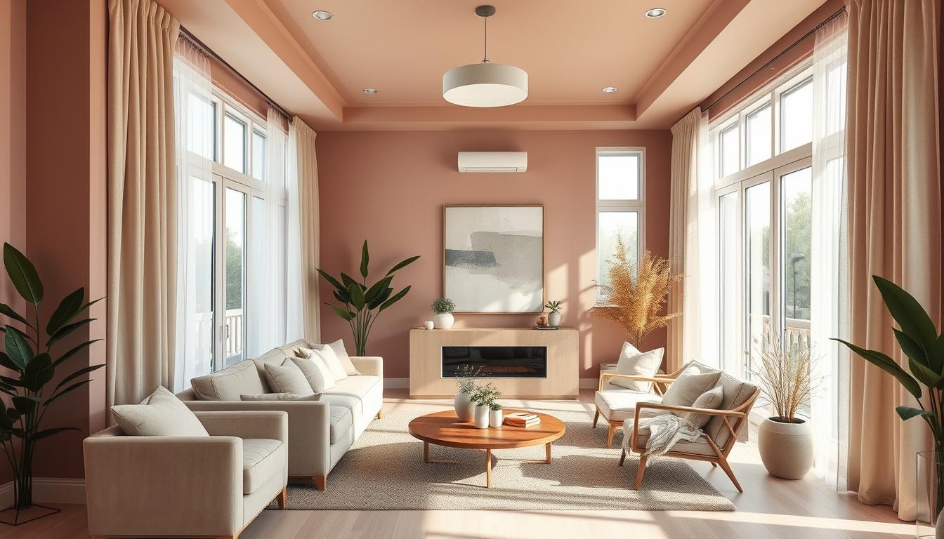
Living Room: Welcoming and Cozy
The living room is where we spend most of our time. It’s important to make it welcoming and cozy. Warm neutrals like beige, taupe, or soft gray can create a calming vibe. Rich colors like terracotta or deep blue can add luxury.
Think about the natural light in your living room when picking a color. If it’s bright, choose a bolder shade. For less light, pick a lighter color to brighten the space.
Bedroom: Relaxation and Comfort
The bedroom should be a place of relaxation and comfort. Soft, muted colors like pale blue, lavender, or mint green can create a soothing atmosphere. Perfect for unwinding after a long day.
For a dramatic look, consider rich jewel tones like emerald green or navy blue. These colors add depth and coziness, making the bedroom feel more intimate.
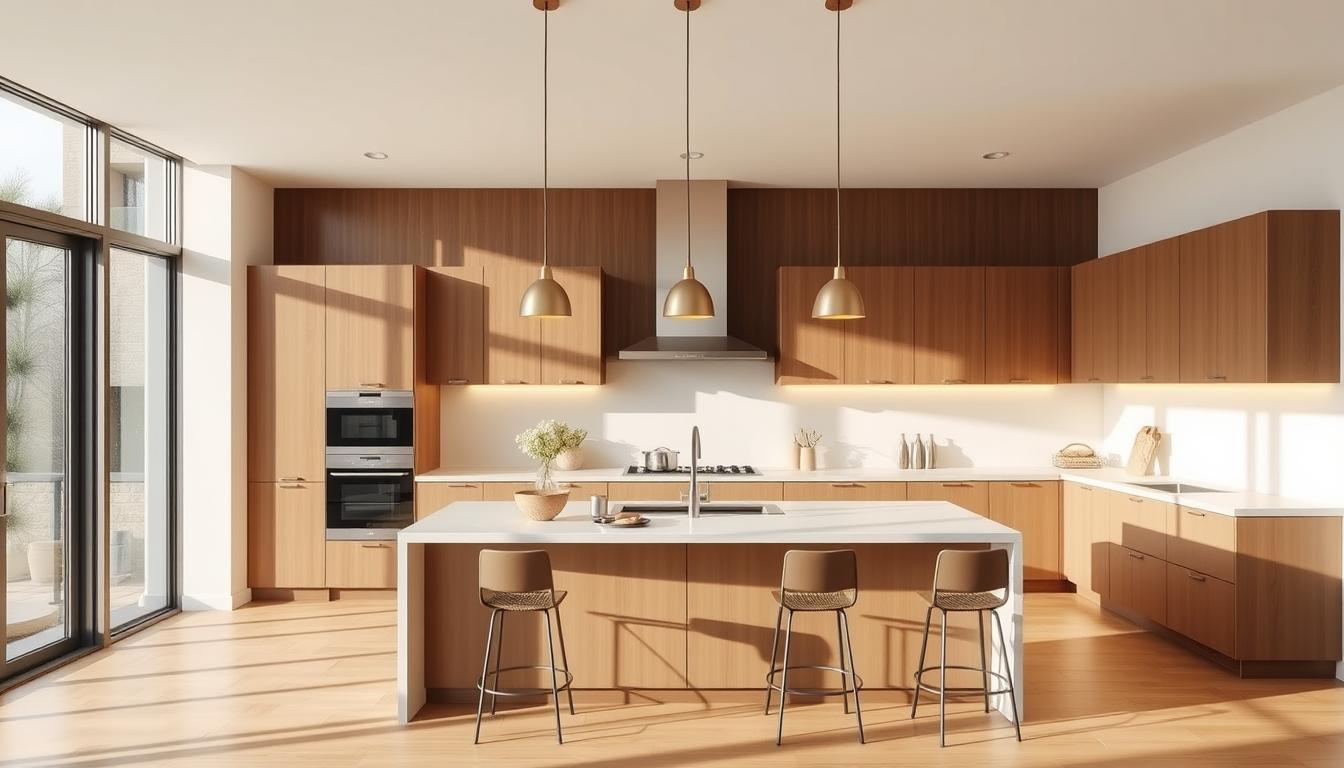
Kitchen: Invigorating and Functional
The kitchen is the heart of the home, where meals are made and memories are created. Bright, cheerful colors like yellow, orange, or red can stimulate appetite and energy. Making the kitchen feel more invigorating.
For a subtle look, soft whites, creams, or light grays are good choices. These colors make the kitchen feel clean and functional, while providing a neutral backdrop for your cooking.
| Room | Recommended Colors | Atmosphere |
|---|---|---|
| Living Room | Warm neutrals (beige, taupe, soft gray), rich colors (terracotta, deep blue) | Welcoming, cozy, luxurious |
| Bedroom | Soft, muted colors (pale blue, lavender, mint green), rich jewel tones (emerald green, navy blue) | Relaxing, comfortable, intimate |
| Kitchen | Bright, cheerful colors (yellow, orange, red), soft neutrals (white, cream, light gray) | Invigorating, functional, clean |
By considering each room’s unique characteristics and purposes, we can choose colors that enhance our home’s beauty and function.
4. Combining Colors: Creating a Cohesive Look
When painting our homes, mixing colors right is crucial. The right mix can make our homes look better and feel more welcoming.
Understanding how to mix colors is key. It helps us pick colors that go well together, making our spaces feel harmonious.

Monochromatic Schemes: A Simplified Approach
A monochromatic scheme uses different shades of one color. This makes choosing colors easier, as we don’t have to mix different hues.
Monochromatic schemes help create a unified look. Using different shades of one color adds depth without the complexity of many colors.
Complementary Colors: Balancing Warm and Cool Tones
Complementary colors are pairs that are opposite each other on the color wheel. They create a striking contrast, making a room more interesting.
For example, mixing warm tones like orange with cool tones like blue can balance a room. As “The key to successfully using complementary colors is to balance them in a way that creates harmony rather than discord.”
To balance them, use one color as the main shade and the other as an accent. This way, we get the best of both worlds without losing cohesion.
Designer Emily Henderson once said,
“Color is a powerful tool in interior design, and when used thoughtfully, it can completely transform a space.”
By using color combination principles, we can create beautiful, functional spaces.
5. Techniques for Painting with Color
To give your home a fresh look, learn a few painting techniques. The right methods can make a room feel welcoming and look great. We’ll look at some top ways to paint with color.
Accent Walls: Adding Dimension to Our Space
Accent walls are a great way to add depth and character. Painting one wall in a bold color creates a focal point. This works well in living rooms and bedrooms, making a statement wall the room’s centerpiece.
When picking a color for your accent wall, think about the room’s color scheme and mood. A warm color like terracotta can make a room cozy. A cool blue can help you relax.
Color Blocking: Creative Ways to Divide Areas
Color blocking uses different colors to divide a space. It’s perfect for open-plan homes, creating zones like kitchens, dining, or living areas.
To do color blocking right, pick colors that go well together. Use a main color and one or two accent colors for interest. The goal is to balance the colors so they enhance the space without being too much.
| Technique | Description | Best Used In |
|---|---|---|
| Accent Walls | Painting one wall in a contrasting color to create a focal point. | Living rooms, bedrooms |
| Color Blocking | Using multiple colors to define different areas within a space. | Open-plan homes, kitchens, dining areas |
Using these techniques in your painting project can make your interior more lively and engaging. Whether you choose an accent wall or color blocking, the right color use can really improve your home’s look.
6. Seasonal Color Ideas for a Fresh Look
Seasonal color changes can make our homes feel fresh and connected to nature. By using interior paint color inspiration that matches the season, our homes stay updated and vibrant.
Spring: Bright and Cheerful Palettes
Spring is the best time to bring bright, cheerful colors into our homes. Soft yellows, gentle greens, and sky blues remind us of blooming flowers and sunny days. These colors can brighten up a room or be used on accent walls for a welcoming feel.
For a softer look, try pastel shades. Pastel pink, for example, can add a romantic touch to any room.
Fall: Warm and Inviting Tones
When fall comes, our color choices shift to warmer, inviting tones. Rich oranges, deep reds, and earthy browns bring a cozy feel, like autumn leaves and fires. These colors are perfect for living areas and dining rooms, where we spend time during the cold months.
To balance these bold colors, pair them with neutral shades on trim and furniture. This creates a color palette ideas for home painting that’s both seasonal and timeless.
Embracing seasonal colors lets us refresh our homes and keep our decor in sync with nature. Whether we love spring’s bright colors or fall’s warm tones, there’s plenty of interior paint color inspiration to explore.
7. Tips for Testing Paint Colors Effectively
Testing paint colors is key to getting the right look in your home. Choosing the perfect color is important, but testing it is often overlooked.
To make sure the color works, we need to test it in different lights. This means more than just a small swatch on the wall. It’s about seeing how the color looks in different lights throughout the day.
Sampling Shades: How to Choose the Best Color
Sampling shades is a crucial step in painting. It lets us see how colors will look on our walls before we decide. Here are some tips for sampling shades well:
- Paint large swatches: Instead of small samples, paint big swatches on the wall. This gives a better color sense.
- Observe at different times: Watch the color at different times of day. See how it changes in different lights.
- Consider the surroundings: Think about the colors of furniture, flooring, and other room elements. They can change how the paint color looks.
By following these tips, we can make a better choice for our paint color.
Lighting Considerations: Seeing Colors in Different Lights
Lighting greatly affects how paint colors look in our homes. Natural light, artificial light, and light direction all change the color’s look.
| Lighting Type | Effect on Color |
|---|---|
| Natural Light | Can make colors appear more vibrant and true to their hue. |
| Artificial Light | Can alter the color’s appearance, sometimes making it appear warmer or cooler than it actually is. |
| Directional Light | Can create shadows that affect how the color is perceived on different parts of the wall. |
Knowing about these lighting effects helps us pick a paint color that looks good in all lights.
By considering both sampling shades and lighting effects, we can test paint colors effectively. This helps us achieve the look we want for our home interiors.
8. Sustainability in Paint Choices
The paint we choose for our homes can greatly affect our indoor air quality and the environment. As we become more aware of our ecological footprint, the need for sustainable paint options grows.

Eco-Friendly Paint Options: Caring for Our Planet
Eco-friendly paints are made from natural ingredients. They have a lower environmental impact than traditional paints. These paints are free from harsh chemicals, making them a healthier choice for our families and the planet.
Benefits of Eco-Friendly Paints:
- Reduced VOC emissions
- Biodegradable ingredients
- Sustainable production processes
Low VOC Paints: Healthier Choices for Our Homes
Low VOC (Volatile Organic Compound) paints are made to reduce indoor air pollution. By choosing low VOC paints, we can make our homes healthier. This is great for those with respiratory issues.
Key advantages of Low VOC paints include:
- Improved indoor air quality
- Reduced health risks associated with VOC exposure
- Compliance with environmental regulations
Choosing eco-friendly and low VOC paints improves our home’s look. It also helps create a more sustainable future.
9. The Impact of Finishes on Color Perception
The sheen of your paint changes how you see the color in your home. Choosing paint isn’t just about picking a color. The finish also affects the look and how long the paint lasts. We’ll look at how finishes change color perception and how to pick the best one for each room.
Matte vs. Gloss: Understanding the Difference
Paint finishes range from matte to high gloss. Each has its own look and use. Matte finishes are flat and hide imperfections well. They’re great for quiet areas and create a calm feel.
Glossy finishes are shiny and last long. They’re perfect for busy spots and easy to clean, like trim and doors.
Choosing between matte and gloss depends on the room’s use and upkeep. Glossy is easy to clean but shows marks. Matte looks smooth but might need more touch-ups.
Choosing the Right Finish for Each Room
Every room in your home has its own needs for paint finishes. Bedrooms and living rooms do well with matte or satin. They offer a cozy feel without being too shiny.
Kitchens and bathrooms need tough finishes like semi-gloss or gloss. They handle moisture and cleaning well.
When picking a finish, think about trending interior paint colors and how they look with different sheens. Some colors pop more or change with glossy finishes. Try samples and think about the room’s lighting to choose wisely.
The right paint finish can make your home look better and be easier to care for. By thinking about each room’s needs and home painting color ideas interior, you can get a stylish and practical look.
10. Seeking Professional Help: When to Consider Hiring Experts
Choosing the right colors and techniques for interior painting can be tough. If you’re not sure about your desired look, it might be time to get professional help. Experts can guide you on interior design color schemes and painting tips.
Expert Guidance on Color Selection
A professional color consultation can help you make informed decisions. Experts will analyze your space and suggest color palettes that fit your style. They also share the latest trends and painting techniques.
Finding the Right Professional for Your Project
To find the right painter, look for those experienced in interior design and painting. Check their portfolios, read reviews, and ask for referrals. This ensures you hire someone who can meet your expectations.