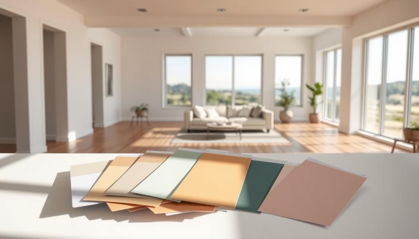
Did you know that the colors in your home’s interior can change how you feel? The right colors can make a room feel bigger, cozier, or more lively. Let’s explore the latest trending house paint colors to improve your living space.
We’ll look into why certain colors affect us the way they do. You’ll learn how to pick colors that match your home’s ambiance. This way, your space will show off your personality and style.
Key Takeaways
- Understanding color psychology for interior design
- Latest trending house paint colors for 2023
- Tips for choosing the right color palette for your space
- How to use color to enhance your home’s ambiance
- Popular color combinations for a cohesive look
Understanding Color Psychology in Home Design
Colors can greatly affect our mood and actions. This makes color psychology very important in home design. Studies show that different colors can make us feel different emotions and create unique moods in our homes.
Knowing how colors make us feel and how to use them is key. It helps in creating a welcoming and cozy living space.
The Emotional Impact of Colors
Different colors can make us feel different ways. Warm colors like red, orange, and yellow make us feel energetic and excited. Cool colors like blue, green, and purple help us relax and feel calm.
By knowing how these colors affect us, we can choose the best interior color schemes for our homes.
| Color | Emotional Impact |
|---|---|
| Red | Energy, Passion |
| Blue | Calmness, Serenity |
| Green | Balance, Harmony |
Creating Ambiance with Color
The mood of a room is greatly influenced by its colors. By picking the right colors, we can make a room feel a certain way. For example, a living room with warm colors can feel cozy, while a bedroom with cool colors can be a peaceful place to rest.
To get the mood we want, we need to think about how colors work together. We also need to consider how they look with lighting and other design elements. This way, we can make a home that feels welcoming and shows our personal style, matching the top home decor color trends.
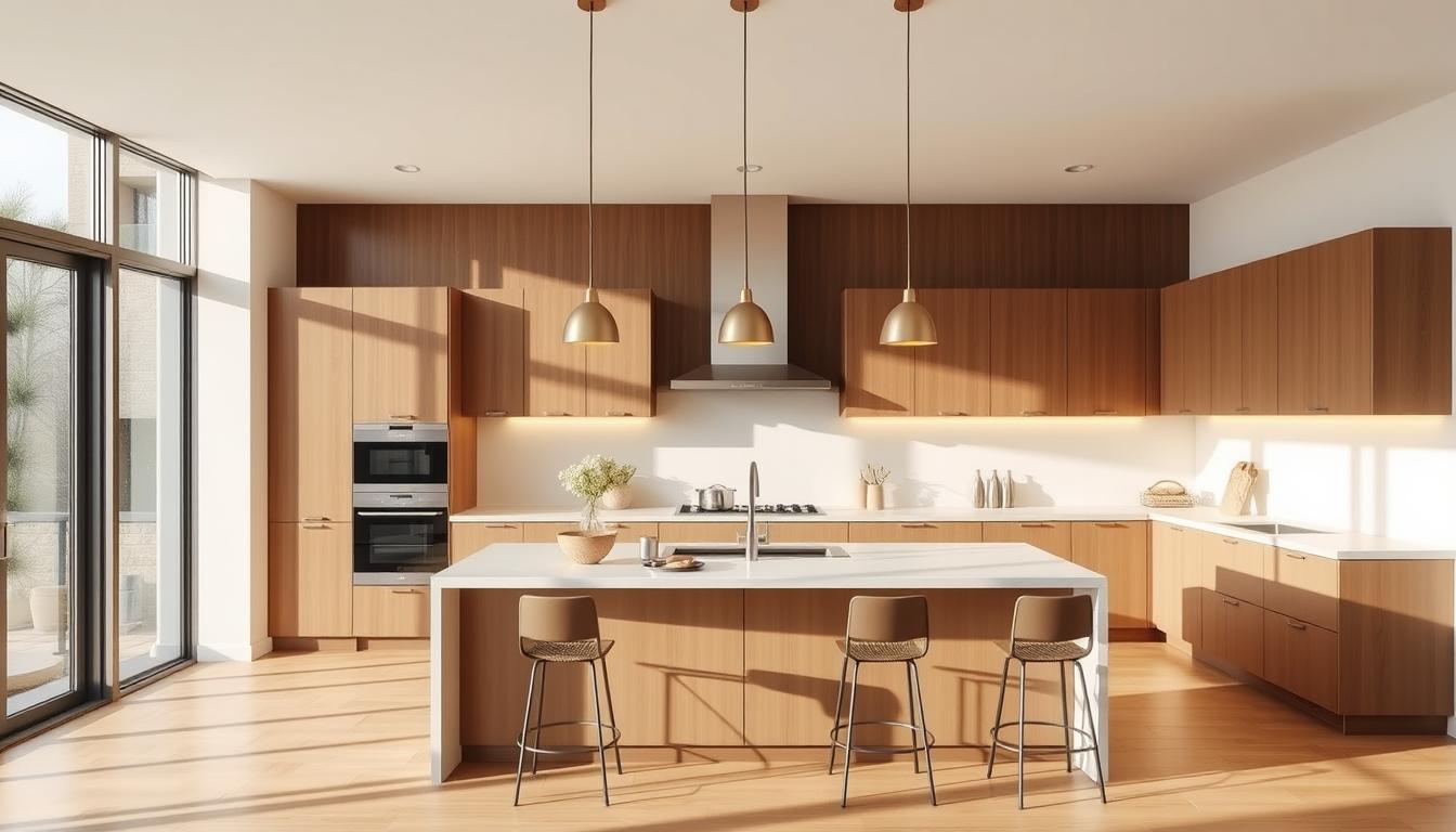
Top Neutral Colors for Modern Homes
Modern homes look great with neutral colors. These colors are versatile and work well with many decorating styles. White and grey are favorites because they create a clean, minimalist look.
Shades of White
White is a classic choice for homes. It brings a clean, crisp feel. Different whites can change a room’s mood.
- Pure White: Perfect for a modern, sleek vibe.
- Soft White: Brings warmth and coziness.
- Warm White: Offers the best of both worlds, great for living areas.
Greys that Maximize Light
Grey is another great neutral color. It makes rooms look bigger and brighter. The right grey can enhance natural light and add sophistication.
- Light Grey: Reflects light, making rooms feel spacious.
- Charcoal Grey: Adds depth, perfect for accent walls.
- Warm Grey: Combines cool tones with warmth, ideal for cozy spaces.
Using these neutral colors in your home design can make it modern and timeless. Whether you like the crispness of white or the elegance of grey, there’s a perfect neutral color for you.
Trendy Accent Colors for 2023
In 2023, the hottest accent colors are those that blend style, sophistication, and creativity. They transform homes into true reflections of their owners’ personalities. Accent colors add depth and character to our living spaces.
Deep Blues and Greens
Deep blues and greens are becoming popular as accent colors. They bring calm and serenity to rooms. These rich hues work well in furniture, accessories, and accent walls, creating a cozy atmosphere.
For example, a deep blue accent wall can be the focal point of a living room. Green accents can add a natural touch to bedrooms.
Bold Reds and Yellows
Bold reds and yellows are making a statement in 2023. These vibrant colors can instantly elevate a room’s mood, adding energy and warmth. They can be used in a bold accent wall or through accessories.
We recommend balancing these bold colors with neutral tones. This helps avoid overwhelming the senses.
Pastel Variations
Pastel colors continue their reign in 2023, offering a softer approach to accenting. Shades of pink, lavender, and mint green are popular. They add whimsy and elegance to rooms.
These gentle hues are perfect for creating a soothing environment. They are ideal for bedrooms and nurseries.
When incorporating these trendy accent colors into your home, think about the aesthetic you want. Whether you prefer the drama of deep blues and greens, the vibrancy of bold reds and yellows, or the softness of pastel variations, there’s a palette for every style. By thoughtfully selecting and balancing your accent colors, you can create a space that is both beautiful and reflective of your personality.
Classic Color Combinations
For a timeless look, try classic color combinations in your home decor. These choices are loved by many for their beauty and harmony. They can make your home look polished and elegant.

Monochromatic Schemes
A monochromatic scheme uses different shades of one color for a unified look. It can make a room feel bigger and more peaceful. For example, using blues from light to navy can create a calming atmosphere.
To add depth, mix different textures and tones within the color family.
Complimentary Color Pairing
Complimentary color pairing pairs colors opposite each other on the color wheel. This contrast adds interest and energy to a room. For instance, blue and orange or red and green can brighten your decor.
But, to avoid too much, balance these bold colors with neutral ones.
When using classic color combinations, think about the look and mood you want. Whether it’s a monochromatic scheme or complementary colors, aim for a balanced and appealing mix.
By choosing these best interior color schemes, you’ll beautify your home and follow top home decor color trends. The right colors can make your space welcoming and show off your style.
Choosing the Right Color for Each Room
Different rooms in your home have different uses. The right color can make each room better for its purpose. It’s important to pick colors that match the room’s role and mood.
Living Rooms: Warm vs. Cool Tones
The living room is where family and friends spend time together. Warm tones like beige or golden brown make it cozy. Cool tones like blues can make it calm.
Think about the room’s lighting and furniture when choosing colors. Light rooms can handle cool tones well. Darker rooms might need warmer colors to stay bright.
Bedrooms: Calming Colors
Bedrooms are for rest and relaxation. Calming colors like soft blues or light grey help you sleep better. Stay away from bright colors that can wake you up.
Think about what you like when picking bedroom colors. Some colors are more soothing than others. The 60-30-10 rule can also help: 60% of the room one color, 30% another, and 10% an accent.
Kitchens: Invigorating Shades
Kitchens are full of energy. Invigorating shades like white or yellow make them lively. White kitchens are popular for their clean look and brightness.
| Room | Recommended Colors | Effect |
|---|---|---|
| Living Room | Warm Beige, Cool Blues | Cozy/Calm |
| Bedroom | Soft Blues, Pale Greens | Relaxing/Calming |
| Kitchen | Crisp Whites, Vibrant Yellows | Energizing/Clean |
Choosing colors for your home should match each room’s needs. This way, you create spaces that are not just pretty but also useful and comfy.
Seasonal Color Trends
As the seasons change, so do the top home decor color trends. These trends can refresh and update your home’s decor. We’ll explore how to incorporate these trends into your home through paint, furniture, and accessories.
Spring and Summer Hues
Spring and summer bring lighter, brighter colors to your home. Pastel shades and soft whites are popular during these seasons. You can add these hues with accent pieces or a fresh coat of paint.

| Color | Application | Effect |
|---|---|---|
| Soft Peach | Accent Wall | Warm and Inviting |
| Light Mint | Furniture | Calming and Refreshing |
| Corals | Decorative Accessories | Vibrant and Playful |
Fall and Winter Palettes
As fall and winter come, warmer, richer colors are appealing. Deep reds and rich browns add coziness. You can use these colors in furniture upholstery, rugs, and wall paint.
| Color | Application | Effect |
|---|---|---|
| Burgundy | Accent Furniture | Luxurious and Cozy |
| Charcoal Grey | Walls | Dramatic and Sophisticated |
| Golden Yellow | Lighting and Accessories | Warm and Welcoming |
By embracing these seasonal color trends, your home’s decor stays fresh and current. It reflects the beauty of each season.
The Role of Lighting in Color Perception
Different lighting can change how colors look in our homes. Lighting is key in how we see colors, making it vital in interior design.
Natural Light vs. Artificial Light
Natural and artificial light affect color differently. Natural light shows colors most accurately, but its intensity and color change throughout the day. Artificial light can be adjusted and is used to add to natural light, mainly at night or in dark areas.
Artificial lighting includes incandescent, fluorescent, and LED bulbs. Each has its own color and how it shows colors. Knowing these differences helps pick the right light for your home.
How Different Bulbs Affect Color
The light bulb type greatly changes color perception. Here’s how different bulbs affect color:
| Light Bulb Type | Color Temperature | Effect on Colors |
|---|---|---|
| Incandescent | Warm (2700K-3000K) | Enhances warm tones, makes cool tones appear less vibrant |
| Fluorescent | Cool (3500K-5000K) | Makes colors appear more vivid, can make warm tones seem less cozy |
| LED | Variable (2700K-6500K) | Offers a range of color temperatures, can be tailored to specific color schemes |
When picking lighting, think about your color scheme and desired mood. For cool tones, fluorescent might work well. For warm tones, incandescent or warm LED is better.
Knowing how lighting and bulb types impact color helps choose the best interior color schemes and favorite interior design color palettes for your home.
Painting Techniques to Elevate Colors
Transform your walls with innovative painting methods that add depth and character to your home. Painting techniques can significantly enhance the aesthetic appeal of your living spaces, making them more inviting and personalized.
Using the right painting techniques, you can create a unique and stylish look that reflects your personality. Whether you’re looking to update a single room or your entire home, the right approach can make all the difference.
Two-Tone Walls
Two-tone walls are a popular trend in home decor, offering a versatile way to add visual interest to any room. By dividing the wall into two sections, typically with a darker shade below and a lighter shade above, you can create a striking effect that draws the eye.
This technique is not only aesthetically pleasing but also practical. For instance, using a darker color on the lower half can help hide scuffs and marks, making it ideal for high-traffic areas.
Accent Walls and Murals
Accent walls and murals are another effective way to elevate your home’s colors. An accent wall, painted in a bold or contrasting color, can serve as a focal point in the room, adding energy and personality.
Murals, on the other hand, offer a more artistic approach, allowing you to bring a theme or story into your home. From serene landscapes to vibrant abstract designs, murals can transform a plain wall into a masterpiece.
| Technique | Description | Best For |
|---|---|---|
| Two-Tone Walls | Dividing the wall into two sections with different colors | Adding depth and visual interest |
| Accent Walls | Painting one wall in a bold or contrasting color | Creating a focal point in the room |
| Murals | Artistic designs painted directly on the wall | Bringing a theme or story into the home |
By incorporating these painting techniques into your home decor, you can stay on top of the top trending wall colors for homes while expressing your personal style. Whether you prefer the subtlety of two-tone walls or the drama of a mural, there’s a painting technique to suit every taste and decor.
Sustainable Paint Options
Homeowners are now looking for sustainable paint options. This is because they want to live in a way that’s better for the planet. They also want their homes to be healthier.
Our choices have a big impact on the environment. This includes the paint we use on our walls. Eco-friendly paint options are becoming more popular. They let us make our homes beautiful without harming the planet.
Eco-Friendly Brands to Consider
Many brands are leading the way in sustainable paint. Some top eco-friendly brands include:
- Farrow & Ball, known for their low-VOC (Volatile Organic Compound) paints.
- Benjamin Moore’s Natura line, which offers zero-VOC options.
- Behr’s Premium Plus ULTRA, a low-VOC paint that is both durable and affordable.
These brands focus on making paints that are safe for our health and the environment.
Non-Toxic Paints and Their Benefits
Non-toxic paints don’t have harmful chemicals. This means they don’t pollute our homes. The benefits of using non-toxic paints are:
- They improve the air quality in our homes, making them healthier.
- They have a lower environmental impact, as they are made to be more eco-friendly.
- They come in a wide range of colors, thanks to many eco-friendly brands.
Choosing non-toxic, sustainable paints lets us create beautiful spaces. These spaces are not only stunning but also help our planet.
When picking sustainable paint, always check the labels. Look for certifications like Greenguard Gold or California’s VOC standards. These ensure the paints are safe for indoor air and the environment.
Personalizing Space with Color
The colors you pick for your home can make it feel more welcoming and unique. Using color to personalize your space is a great way to show your personality and style.
Incorporating Personal Preference
When picking colors for your home, think about what you like. Consider the colors that make you feel good and the emotions they bring up. Do you like calming shades or vibrant hues? Your taste should guide your color choices to make your home feel like yours.
To add your personal touch, start by picking a few colors you love. Look to your favorite art, furniture, or nature for inspiration. Creating a color palette that shows your style will make your space feel more real.
Balancing Trends with Timelessness
It’s tempting to follow the latest top home decor color trends. But, it’s important to mix them with timeless elements to avoid a dated look. Try combining trendy colors with classic shades that won’t go out of style soon.
For example, if you love a certain trending house paint color, use it as an accent wall or in decorative items. Choose timeless colors for your big furniture and main walls. This way, you can enjoy current trends while keeping a timeless base.
By carefully choosing colors that reflect your taste and balancing them with timeless choices, you can make a home that’s both beautiful and uniquely yours.
Future Color Trends to Watch
Looking ahead, we see new color trends for home design. These trends are shaped by culture and society. They change our living spaces in exciting ways.
In 2024, expect bold and vibrant colors. Neutral tones will also stay popular for their calm feel. The best color schemes will mix these, creating beautiful spaces.
Emerging Hues for 2024
Deep blues and greens will be big in 2024, for living rooms and bedrooms. They bring sophistication and warmth. These colors make our spaces cozy.
Cultural and Societal Influences
Culture and society shape our color choices. With more global connections, we see a mix of colors. Our favorite color palettes now include many styles and hues.