Did you know a good interior design color scheme can change how your home feels? A single color scheme makes your home look intentional and well-planned.
Finding the right home interior color combinations can seem hard. But, it doesn’t have to be. At Kaiaruang, we know how key it is to pick colors that show your style and match your home’s look.
In this article, we’ll share our best color combination ideas. They’ll help you turn your living space into a stunning and peaceful place.
Key Takeaways
- Learn the basics of color theory for a harmonious scheme.
- Think about your space’s natural light and architecture when picking colors.
- Try out different color mixes to find the perfect one for you.
- Use online tools or talk to a pro for ideas and help.
- Make your home look cohesive with a single color scheme.
Understanding Color Theory in Home Design
Color theory is key in home design for a harmonious look. It helps us pick colors that work well together. This is important for both homeowners and designers.
The Basics of Color Wheel
The color wheel is a basic tool in color theory. It shows how colors relate to each other. The color wheel helps us mix colors well. Knowing the color wheel lets us choose colors that make our homes look great.
Primary, Secondary, and Tertiary Colors
Primary colors are red, yellow, and blue. They can’t be made by mixing other colors. Secondary colors come from mixing two primary colors, like orange (red + yellow) and green (blue + yellow). Tertiary colors mix primary and secondary colors, like blue-green.
Knowing these color types is key for coordinating colors for home interiors well.
Color Harmonies and Their Impact
Color harmonies are when colors work together well. There are different ways to do this, like complementary, analogous, and triadic color schemes.
“Colors, like features, follow the changes of the emotions,”
as Pablo Picasso said. Using these principles, we can pick colors that show our style and change how our rooms feel. For example, complementary colors can make a room feel bold, while analogous colors can make it calm.
Understanding color harmonies is important for keeping up with color trends for home decor. It helps us make smart choices about our home’s colors.
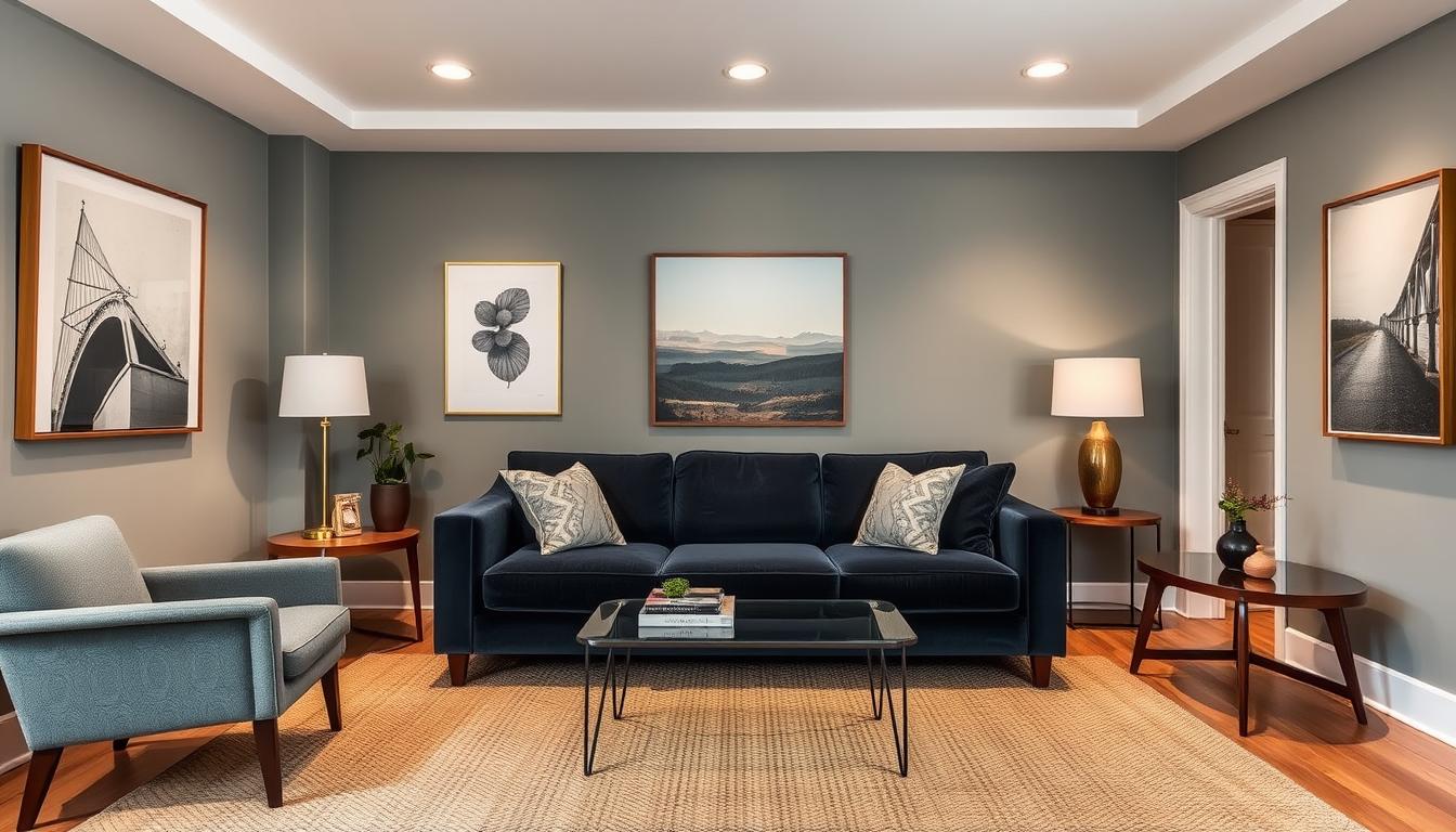
Popular Color Combinations for Living Rooms
The color you pick for your living room changes how it feels. A good color scheme makes it cozy and perfect for relaxing or having fun.
Living rooms often use warm neutrals and earthy tones. These colors make the room feel welcoming and cozy. They’re great for family rooms or places where you spend a lot of time.
Warm Neutrals and Earthy Tones
Beige, taupe, and caramel are popular for living rooms. They go well with earthy tones like sage green, terracotta, and sandy blues. This mix creates a natural and calming feel.
Bold Accents with Cool Shades
For a bold look, try bold accents with cool shades. Cool colors like blues and greens add elegance. Pairing them with bold furniture or decor creates a striking contrast.
Monochromatic vs. Complementary
You can choose between monochromatic or complementary color schemes. Monochromatic uses different shades of one color for a cohesive look. Complementary colors, on the other hand, are opposite each other on the color wheel, creating a bold contrast.
Both options have their benefits. Your choice depends on your taste and the look you want for your living room.
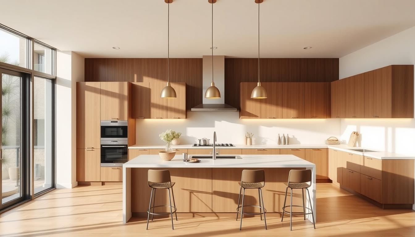
Choosing Colors for Your Kitchen
The kitchen is often seen as the heart of the home. Choosing the right colors can make it both functional and beautiful. Think about the mood you want to create when picking a color scheme.
Bright Whites and Soft Pastels
Bright whites and soft pastels are great for kitchens. They make the space feel clean and open. These colors are perfect for kitchens that don’t get much natural light.
Using bright whites on cabinets and soft pastels on walls creates a welcoming feel. This combo is also flexible. You can add more color with accessories and decor.
Dark Hues for a Cozy Feel
Dark hues can make your kitchen feel cozy. They add depth and warmth, making the space feel more intimate.
But, it’s important to mix dark colors with lighter shades. This prevents the kitchen from feeling too small. Try pairing dark cabinets with light countertops for a nice contrast.
The Impact of Color on Cooking
Colors can affect how you cook and feel in your kitchen. Some colors can make you hungrier, while others can help you relax.
Warm colors like red and orange boost energy and appetite. They’re great for kitchens where you want to be active. Cool colors like blue and green can help you relax. They’re perfect for kitchens where you want to unwind.
| Color | Effect on Cooking | Ideal Use |
|---|---|---|
| Red | Stimulates appetite | Active kitchens |
| Blue | Promotes relaxation | Calm kitchens |
| Green | Enhances focus | Kitchens with cooking stations |
Bedroom Color Schemes that Promote Relaxation
Choosing the right interior design color schemes is key to a peaceful bedroom. Our bedroom is where we find rest and recharge. So, the colors we pick can greatly affect our ability to relax and sleep well.
Soothing Blues and Greens
Soothing blues and greens are favorites for bedrooms. They help us relax and feel calm. These colors remind us of nature, bringing peace to our bedroom.
For example, light blue walls with green accents can make a room feel calm. BHG says these colors can really improve our bedroom’s feel.
Elegant Grays and Whites
Elegant grays and whites are also great for bedrooms. They add sophistication and cleanliness. A scheme using different shades of gray and white can make a room feel calm and cohesive.
These colors also let you add colorful accent pieces easily. It’s a smart way to keep your room looking good and feeling calm.
Touches of Warmth with Accent Colors
While cool colors like blues and greens are calming, adding coordinating colors for home interiors with accent pieces can warm up the room. For example, a throw blanket in a warm color can add coziness to cool-colored walls.
It’s about finding the right mix of calm and cozy. By picking the right colors, we can make our bedroom not only look good but also help us relax and sleep better. Whether we choose soothing colors, elegant whites and grays, or add warm accents, the goal is to create a peaceful space.
Transforming Bathrooms with Color
A well-designed bathroom color scheme can make the room feel special. It can turn your bathroom into a place of relaxation or a refreshing space.
Crisp Whites and Shades of Blue
Crisp whites and blues are favorites for bathrooms. They bring a clean and refreshing feel. “The calming effect of blue is unmatched in bathroom design,” say experts.
This classic mix is both timeless and versatile. It’s easy to add to your bathroom design.
Muted Tones for a Spa-Like Effect
For a spa-like feel, try soft grays, taupes, or gentle greens. These colors help you relax and unwind. They make your bathroom feel like a luxurious spa.
Playful Colors for a Fun Vibe
Playful colors can add personality to your bathroom. Bright colors like coral, turquoise, or yellow bring fun and energy. But, balance them with neutral elements to avoid too much.
Think about the look you want for your bathroom. Whether calm or vibrant, the right colors can make it your own special space.
Color Combinations for Home Offices
Choosing the right colors for your home office is key to staying productive and focused. A well-chosen color scheme can boost creativity and help you concentrate better.

Energizing Yellows and Bright Whites
Energizing yellows and bright whites can really up your productivity and energy. These colors make your space feel open and bigger. For more tips on designing your home, check out our guide on crafting the perfect Java home interior.
Calming Blues for Focus
Calming blues are great for focus and concentration. They have a soothing effect on your mind, reducing stress and improving clarity.
The Power of Earthy Tones
Earthy tones add a natural and calming vibe to your office. They make your space warm and cozy, perfect for creativity and productivity.
In conclusion, picking the right colors for your home office is vital for a productive space. By exploring trending interior color combinations and home interior color combinations, you can create a space that boosts your work experience.
Accent Walls: A Bold Choice
Accent walls are a key part of home decor. They add a bold touch to any room. This makes them great for adding personality to your home.
Choosing the Right Color for Impact
Picking the right color for your accent wall is important. It can make a big difference in the room’s feel. Think about the room’s purpose and the mood you want to create.
For example, a bold red can make a living room lively. A soothing blue can make a bedroom peaceful.
When choosing, consider:
- The room’s natural light
- The colors of your furniture and decor
- The look you want to achieve
Techniques to Create Depth and Interest
There are many ways to make accent walls interesting. Using a darker shade can make a room cozy. Adding a bold pattern or texture can also add interest.
| Technique | Description | Effect |
|---|---|---|
| Darker Shade | Using a darker version of the room’s color | Creates coziness |
| Bold Pattern | Adding a bold pattern or texture | Adds visual interest |
| Contrasting Color | Using a color opposite on the color wheel | Creates a striking contrast |
Balancing with Complementary Colors
It’s important to balance your accent wall with complementary colors. These colors are opposite each other on the color wheel. They help create a harmonious and appealing space.
For example, a deep blue accent wall can be balanced with orange or yellow. This adds interest and creates a balanced look.
By choosing the right color and technique for your accent wall, and balancing it with complementary colors, you can greatly improve your home’s design.
Outdoor Color Combinations for Curb Appeal
The right outdoor colors can make a big difference. Your home’s exterior sets the tone for your property. Choosing the right colors can boost its curb appeal.
Nature-Inspired Palettes
Nature-inspired colors add elegance to your home’s exterior. Shades of green, earthy tones, and blues reflect nature. For example, sage green with sandy beige and driftwood gray looks great together.
- Earthy tones such as terracotta and sienna
- Soft greens like moss and sage
- Weathered wood tones
Using Bold Colors Strategically
Bold colors can highlight your home’s best features. A bold front door adds personality. Try deep blues, vibrant reds, or sunny yellows for a statement.

- Deep blues that evoke a sense of calm
- Vibrant reds that add energy
- Sunny yellows that bring warmth
Timeless White with Accent Shades
A timeless white exterior is always in style. White is clean and crisp. Accent shades add depth and character. Warm accents like brass or soft pastels welcome visitors.
“A fresh coat of paint in a timeless color can completely transform a home’s exterior.”
Some great accent shade combinations include:
- Soft pastels like pale pink or baby blue
- Warm metallic tones like brass or copper
- Deep charcoals or blacks for contrast
Seasonal Color Trends to Consider
Keeping your home looking vibrant and in style is easy with seasonal color trends. As seasons change, updating your home’s colors can refresh your space. It reflects the current mood and ambiance of the time.
Seasonal color trends can guide your color choices. They help keep your home looking fresh and updated. For example, spring and summer bring bright and cheerful colors. Fall and winter introduce cozier and warmer tones. Let’s see how to use these trends in your home decor.
Spring and Summer Inspires
In spring and summer, light and airy colors are key. They reflect the season’s vibrancy. Some popular color combinations include:
- Soft pastels with crisp whites
- Bright corals and turquoises for a beachy feel
- Minty greens and sunny yellows for a fresh look
You can add these colors with throw pillows, blankets, and wall decor. This gives your home a seasonal refresh.
Fall and Winter Mood Sets
When fall and winter come, warm and rich colors are in. Trending combinations include:
- Deep reds and burgundies with earthy browns
- Soft grays and creamy whites for a winter wonderland
- Rich golds and bronzes for warmth and luxury
Introduce these colors with furniture, rugs, and decorative accents. This creates a cozy and inviting atmosphere.
Transitioning Colors Seamlessly
Switching between seasonal colors can be smooth. Focus on a core color palette all year. Then, add seasonal accents. For example:
- Keep a neutral base color on walls and big furniture.
- Add seasonal colors with accessories like throw pillows and vases.
- Use blankets and rugs to bring in seasonal hues.
By following these steps, you can update your home’s colors easily. This way, you can reflect the current season without a big renovation.
Keeping up with color trends for home decor and using trending interior color combinations can greatly enhance your home’s look. Whether you want to make a bold statement or subtly update, seasonal colors offer a versatile and effective way to keep your home looking great.
How to Test Color Combinations
Before you decide on your home’s color scheme, it’s key to test the colors. This step makes sure the colors you pick go well together. It also helps create the right feel in your home. Testing color combinations involves a few methods to see how they’ll look.
Sample Swatch Techniques
One good way to test colors is by using sample swatches. This means painting small parts of your walls with the colors you’re thinking of. You can use paint samples or colored cards for this. By looking at these swatches, you can pick the best color combinations.
- Choose paint samples or colored cards that match your desired colors.
- Paint small sections of your wall or use colored cards to create swatches.
- Compare the swatches to see how the colors work together.
Lighting Considerations
Lighting greatly affects how colors look in your home. Natural light, artificial light, and the direction of light sources all play a part. It’s important to think about the lighting in each room when testing colors.
Key considerations include:
- The direction your windows face and how much natural light they receive.
- The type of artificial lighting used in the room.
- How the color looks at different times of day.
Using Technology to Visualize
Technology has many tools to help you see how colors will look together. You can use online color picker tools, interior design apps, or software. These tools let you upload a photo of your room and try different colors. They give you a good idea of how the colors will look before you decide.
Final Thoughts on Home Color Choices
Choosing the right colors for your home is a personal and creative journey. We’ve looked at popular color palettes and the best combinations for your home. These ideas can help inspire your design choices.
Personalizing Your Space
Choosing colors that match your style is key. You can mix different styles and trends to make a space that shows who you are. It should also meet your needs.
Expert Guidance
Getting help from a professional designer can be very helpful. They can guide you through tough decisions and new ideas. They can also find the best colors for your home.
Embracing Change
Being open to change and trying new things can lead to exciting results. You can experiment with different color palettes. This way, your home can always reflect your changing tastes.