Did you know the right color palette can change your living space’s feel? A good color scheme makes your home feel welcoming and in harmony.
Choosing the perfect interior design color palettes can seem hard, but it’s not. By learning about color theory and how it applies to decor, you can make a space that shows your personality.
We’ll show you how to pick the best home interior color schemes to change your space. You’ll get expert advice and the newest trends. This will help you make a space that looks good and feels right.
Key Takeaways
- Understand the basics of color theory and its application in home decor.
- Learn how to choose a color palette that reflects your personality.
- Discover expert tips for creating a harmonious and visually appealing space.
- Stay up-to-date with the latest trends in interior design color palettes.
- Create a unified color scheme throughout your home for a well-designed feel.
Understanding the Basics of Color Theory
To make your home look great, knowing color theory is key. It’s about mixing colors in a way that looks good together. It also helps us see how colors work with each other.
The color wheel is at the heart of color theory. It’s a circle that shows how colors are connected.
The Color Wheel and Its Importance
The color wheel is a basic tool for color understanding. It breaks down colors into primary, secondary, and tertiary. This gives us a full view of the color world.
Primary, Secondary, and Tertiary Colors
Primary colors can’t be made by mixing other colors. They are red, blue, and yellow. Secondary colors come from mixing primary colors: orange (red + yellow), green (blue + yellow), and purple (blue + red). Tertiary colors mix primary and secondary colors, like blue-green or yellow-orange.
| Color Type | Colors | Description |
|---|---|---|
| Primary | Red, Blue, Yellow | Cannot be created by mixing other colors |
| Secondary | Orange, Green, Purple | Derived from mixing primary colors |
| Tertiary | Blue-green, Yellow-orange, etc. | Created by mixing primary and secondary colors |
Warm vs. Cool Colors
Colors can be warm or cool. Warm colors like red, orange, and yellow feel cozy. Cool colors like blue, green, and purple are calming and make rooms feel bigger.
Knowing if a color is warm or cool helps in choosing your home’s colors. It ensures your home’s color scheme matches the mood you want.
The Impact of Color on Mood and Emotions
Colors greatly affect the feel of our homes and how we feel. The colors we pick can change our mood, energy, and happiness.
How Colors Influence Our Feelings
Different colors make us feel different ways. For example, blue is often linked with calmness and peace, making it great for bedrooms. On the other hand, red can make us feel more energetic and excited, which is why it’s used in dining rooms or living areas.
It’s important to know how colors make us feel when picking colors for our homes. By choosing colors that match each room’s purpose, we can make spaces that help our mental and emotional health.
Choosing Colors for Different Spaces
The purpose of each room should guide your color choices. Bedrooms do well with calming colors like soft blues or greens, helping us relax and sleep better. Living areas, on the other hand, can be made more lively with warmer tones that encourage socializing and activity.
- Bedrooms: Soft blues, greens, or neutral tones for relaxation.
- Living Areas: Warmer tones like beige, orange, or red for energy.
- Workspaces: Focus-enhancing colors like green or blue.
The Psychology of Color in Home Design
The study of color psychology is complex, looking at how colors affect our emotions and actions. In home design, knowing this can help you choose colors wisely. This way, you can create a space that supports your lifestyle and well-being.
By thinking about the emotional impact of colors, you can design spaces that look good and feel good too.
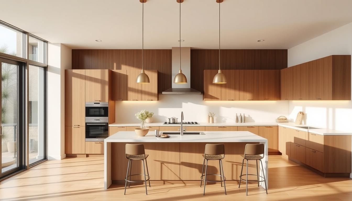
Popular Color Schemes for Home Interiors
Choosing the right color scheme is a big decision in home decorating. The colors we pick can change how our homes feel and look. Let’s look at some top color schemes that are trending in modern home decor.
Monochromatic Color Schemes
A monochromatic scheme uses different shades of one color. It makes a room look bigger and more elegant. For example, using different blues can make a room feel calm.
Monochromatic schemes are great for modern homes because they look clean and simple.
Complementary Color Schemes
Complementary schemes pair colors that are opposite each other on the color wheel. This creates a lively and interesting look. For instance, blue and orange together can make a room feel energetic.
But, it’s important to balance these colors to avoid too much. Using complementary colors right can make a room pop and add a trendy touch.
| Color Scheme | Description | Example |
|---|---|---|
| Monochromatic | Different shades of the same color | Various shades of blue |
| Complementary | Colors opposite each other on the color wheel | Blue and orange |
| Analogous | Colors next to each other on the color wheel | Blue, green, and yellow |
Analogous Color Schemes
Analogous schemes use colors next to each other on the color wheel. They create a natural and smooth look. For example, blue, green, and yellow together can make a room feel fresh.
Analogous schemes are flexible and work well with many decorating styles. They are a favorite in trendy home color schemes.
“The right color scheme can completely transform the feel of a room. It’s not just about picking colors you like; it’s about creating a mood or atmosphere.”
By using these popular color schemes, homeowners can make their homes look better. Whether you choose monochromatic, complementary, or analogous, pick colors that show your style and match your home’s design.
Selecting a Color Palette for Your Home
Choosing the right color palette for your home is key to a beautiful look. “The right color palette can make or break the ambiance of your home,” say many interior designers. It’s not just about picking your favorite colors. It’s about creating a look that goes well with your furniture and decor.
Considering Existing Furniture and Decor
Start by looking at your furniture and decor. This helps you see the colors already in your space. For example, if you have a bold piece of furniture, choose a neutral color palette to balance it. If your furniture is neutral, you can pick bolder colors for your walls.
Experts at Benjamin Moore say choosing colors that match your decor makes your space feel complete.
The Role of Natural Light
Natural light affects how colors look in your home. A color that looks great in a sunny room might not in a dim one. So, think about the light in each room when picking colors. Watch how the light changes and pick colors that look good in different lights.
Testing Colors Before Committing
Test colors before you decide. Paint samples on your walls and see how they look at different times. This helps you understand how the color will look in your home’s light. You can also use online tools or apps to try out colors before you decide.
By thinking about your furniture, the light, and testing colors, you can pick a palette that makes your home beautiful and welcoming.
Creating a Cohesive Look Throughout Your Home
A harmonious home interior is not just about the colors you choose, but how you transition them. It’s important to think about how different spaces flow into one another when designing your home’s interior.
One effective way to achieve a cohesive look is by using a common color or a similar shade throughout different rooms. This technique helps create a sense of continuity and visual harmony. For instance, you can choose a popular home color scheme like a monochromatic palette and vary its shades across different rooms.
Transitioning Color Through Different Rooms
Transitioning colors from one room to another can be done by selecting colors that complement each other. The 60-30-10 rule is a good guideline. Use 60% of the dominant color in main areas, 30% of the secondary color in secondary areas, and 10% of an accent color to add a pop of color.
For example, if your living room is painted a warm beige, you can transition this color into the hallway by using a similar shade or a complementary color that blends well with beige. This creates a smooth visual flow and makes your home feel more connected.
Finding Balance with Neutrals
Neutrals like beige, gray, or white are versatile and can provide balance to bold color choices. Using neutrals as a base allows you to introduce bolder colors through furniture or decor without overwhelming the space. This approach is useful when you want to incorporate a vibrant interior design color palette into your home.
For instance, a neutral-colored wall can serve as a backdrop for a bold-colored sofa or statement piece of art. This balance between neutrals and bold colors creates a visually appealing and harmonious space.
Accent Walls: A Bold Choice
Accent walls are an excellent way to add personality to a room without overwhelming it. By painting one wall in a bold or contrasting color, you can create a focal point that draws the eye and adds visual interest.
When choosing a color for your accent wall, consider the room’s overall color scheme and the mood you want to create. A bold color can add energy and vibrancy, while a softer color can create a calming effect. Remember, the key is to balance your accent wall with the rest of the room’s decor to maintain harmony.
Trends in Interior Color Schemes for 2023
In 2023, interior design is moving towards earthy tones and nature-inspired colors. This trend brings the outdoors into our homes, making them warm and cozy.
Earthy Tones and Nature-Inspired Palettes
Earthy tones are back in 2023. These natural colors, inspired by nature, create calming and organic interiors. Shades like sage green, sandy beige, and driftwood gray are popular for a serene feel.
House Beautiful says earthy tones are top for 2023. They offer a soothing yet stylish palette.

| Color 1 | Color 2 | Color 3 |
|---|---|---|
| Sage Green | Sandy Beige | Driftwood Gray |
| Terracotta | Moss Green | Weathered Wood |
Bold and Vibrant Colors
Bold and vibrant colors are big in 2023. They add energy and personality to any space. Colors like vibrant blues, yellows, deep reds, and oranges are endless options.
Design experts say bold colors can make a room feel dynamic and engaging.
“The right bold color can turn a room into a statement piece.”
- Vibrant blues for a calming yet energetic feel
- Deep yellows to add warmth and optimism
- Rich reds for a dramatic and luxurious ambiance
Soft Pastels as a New Classic
Soft pastels are becoming a new classic in design. These gentle hues offer elegance without being too bold. Shades like pale pink, baby blue, and mint green are used in walls and furniture for a soft, romantic look.
Pairing soft pastels with neutral tones balances the look. Soft pastels are key in modern home color trends.
Incorporating Textures and Patterns
Textures and patterns are key to making your home decor pop. Mixing them adds depth and interest, making your space feel unique and lively.
The Role of Textures in Color Schemes
Textures change how we see colors in a room. Glossy surfaces reflect light, making colors seem brighter. Matte finishes absorb light, softening colors. Using textures like velvet, linen, or wood adds a layered look that enhances your paint color choices.
Mixing different textures prevents a room from feeling dull. For example, a leather sofa, a woven rug, and a wooden coffee table create a complex and interesting space.
Combining Patterns with Colors
Patterns add visual interest to a room. The right patterns with colors create a unique atmosphere. A bold geometric pattern can energize a room, while a subtle floral pattern can calm it.
To not overwhelm the space, balance patterns with solid colors. Use a patterned rug or throw pillows, then pair them with solid-colored furniture or walls.
Accessories That Enhance Your Color Choices
Accessories like throw pillows, rugs, and artwork are functional and enhance your color choices. They can introduce new colors or support existing ones, creating a cohesive look.
When picking accessories, think about how they’ll fit with your color scheme. A vibrant artwork can brighten a room, while a neutral rug can ground it.
Tips for Small Spaces and Color Usage
Decorating small spaces right can change everything. The right colors can make a big difference. They can make the space look bigger and feel more welcoming.
Light Colors to Make Spaces Feel Larger
Light colors on walls and ceilings make spaces feel open. Soft whites, creams, and pale grays are great for small rooms. They reflect light and make the area feel airy.
Using different shades of a light color can add depth. It keeps the space from feeling too cluttered. A semi-gloss or gloss finish can also reflect light, making the space feel even bigger.
Darker Shades for Cozy Atmospheres
Darker colors can make spaces cozy and intimate. Deep blues, rich greens, and warm reds are perfect for cozy areas like bedrooms or reading nooks. They add warmth and comfort.
But, it’s important to balance darker colors with lighter ones. This prevents the space from feeling too closed in. Using a darker color on just one accent wall can add depth without overwhelming the area.
Clever Use of Color in Tight Areas
In tight areas, color can make a big difference. For example, a lighter ceiling can make it feel higher. A darker floor can ground the space.
Here’s a simple guide to using color in small spaces:
| Area | Color Choice | Effect |
|---|---|---|
| Walls | Light colors | Makes space feel larger |
| Ceiling | Lighter than walls | Makes ceiling feel higher |
| Accent Wall | Darker or bold color | Adds depth and interest |
As an interior design expert,
“The key to making small spaces work is to use color to create a sense of flow and continuity.”
This means using a consistent color scheme. It makes the space feel connected and open.
Choosing colors wisely can make small spaces feel larger and more inviting. Whether you want openness or coziness, the right colors can make a big difference.
Color Schemes for Different Rooms
The right color scheme can change a room’s feel. It can make it more welcoming, calm, or lively. Each room in our homes has its own purpose. Their colors should match this to make them both useful and beautiful.
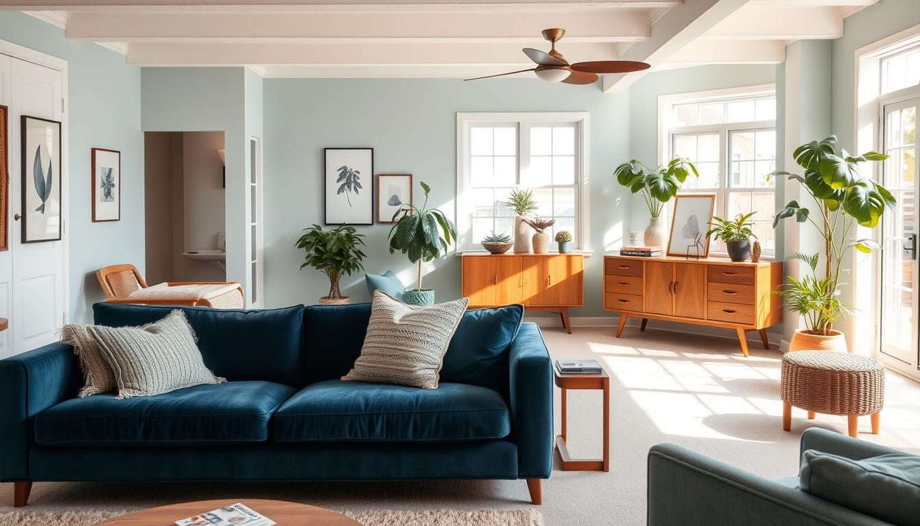
Living Room Color Ideas
The living room is where we spend time with loved ones. Warm colors like beige, soft grays, and taupe make it cozy. Adding navy blue or emerald green brings sophistication.

Bedroom Serenity: Calm and Cozy
Bedrooms are our retreats. Soft blues, pale lavenders, and gentle greens help us relax. Cream and light gray also make a peaceful space, perfect for unwinding.
Dynamic Colors for Playrooms
Playrooms are for fun and creativity. Bright colors like red, yellow, and blue spark imagination. Mixing bold colors makes it a lively place for play.
| Room Type | Recommended Colors | Atmosphere Created |
|---|---|---|
| Living Room | Warm beiges, soft grays, navy blue | Cozy, inviting, sophisticated |
| Bedroom | Soft blues, pale lavenders, gentle greens | Calm, serene, relaxing |
| Playroom | Bright red, sunny yellow, electric blue | Vibrant, energetic, stimulating |
Choosing the right colors for each room improves your home’s feel and use. Whether it’s a cozy living room, a calm bedroom, or a lively playroom, pick colors that fit the room’s purpose and your taste.
Using Paint Effectively in Your Color Scheme
Choosing the right paint for your walls is more than picking a color. It’s about knowing how different finishes change your space. The finish of your paint greatly affects your color scheme’s look and how long it lasts.
Choosing the Right Finish for Your Walls
The finish you pick for your walls changes the room’s look and feel. Finishes vary in sheen and durability, fitting better in some rooms than others.
Flat finishes are non-reflective and great for areas that don’t get a lot of use. They’re perfect for ceilings and walls in quiet spots. In contrast, satin and semi-gloss finishes are durable and easy to clean. They’re best for busy areas, kitchens, and bathrooms.
| Finish Type | Sheen Level | Durability | Best Use |
|---|---|---|---|
| Flat | Low | Low | Low-traffic areas, ceilings |
| Satin | Medium | Medium to High | High-traffic areas, living rooms |
| Semi-gloss | High | High | Kitchens, bathrooms, trim |
Think about each room’s needs when picking a paint finish. Kitchens and bathrooms need satin or semi-gloss for moisture resistance and easy cleaning. Bedrooms and living rooms might prefer flat or eggshell for a softer look.
Knowing about paint finishes helps you choose wisely for your home’s color scheme. Whether you’re looking for the best color combinations for interiors or interior paint color ideas, the right finish makes a big difference in achieving a beautiful look.
The Benefits of Professional Color Consultation
A professional color consultation offers personalized insights. It helps you make informed decisions about your home’s color scheme. Working with experts can unlock your living space’s full potential.
Collaborating with Interior Designers
Working with an interior designer is very beneficial when choosing colors for home decor. These experts guide you through many color options. They ensure your choice is both beautiful and functional.
Interior designers can help you:
- Understand the latest modern home color trends
- Select a color palette that complements your existing furniture and decor
- Create a cohesive look throughout your home
The Value of Expert Advice on Color Choices
Expert advice on color choices is invaluable. It’s great when you’re unsure or need help making a cohesive decision. Professionals offer tailored advice based on your preferences, home style, and trends.
| Benefits of Professional Color Consultation | Description |
|---|---|
| Personalized Insights | Expert advice tailored to your preferences and home style |
| Latest Trends | Stay updated with the latest modern home color trends |
| Cohesive Design | Ensure a beautiful and functional color scheme throughout your home |
Bringing Your Vision to Life
With a professional color consultant, you can bring your vision to life. They help you navigate the complex world of color schemes. The result is a space that truly reflects your personality and style.
Investing in professional color consultation means more than just choosing a color scheme. It’s about creating a home that feels truly yours.
Maintaining Your Color Investment
To keep your home looking its best, regular maintenance is key. This means repainting walls when needed and keeping decor in line with your color schemes.
Regular Maintenance Tips
Touch-ups are crucial to keep your space beautiful. By repainting and updating decor, your home stays fresh and modern.
Adapting to Seasonal Changes
Seasonal changes offer a chance to refresh your decor. Adding seasonal colors or themes can update your color schemes and keep your space modern.
Updating Your Color Scheme
It’s important to reassess your color palettes over time. Making updates ensures your color scheme reflects your style and maintains your investment’s value.
Following these tips helps you enjoy a beautiful, cohesive home. Your home will showcase your personal style through trendy color schemes and interior design.